Which Clay Brick colour is right for your project?
MM_E")
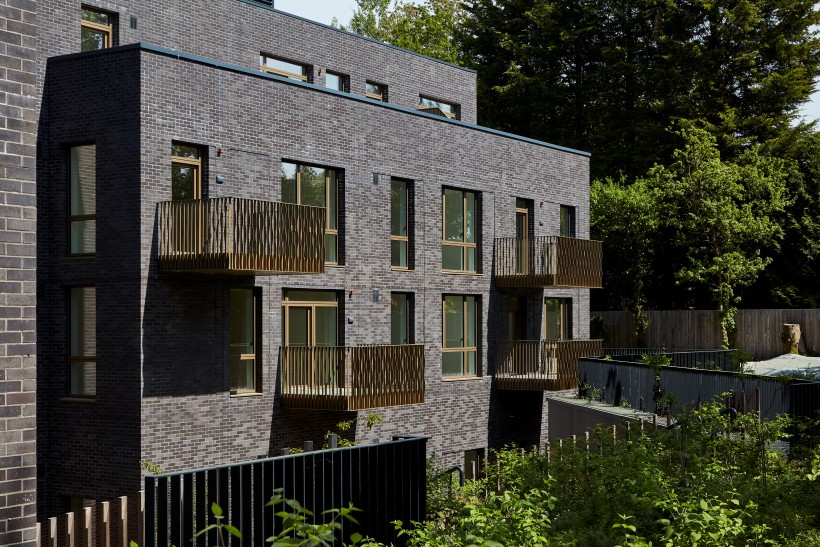
Brick has always carried colour as part of its character. From the warm reds of historic townscapes to the cooler greys that define many modern cities, the colour of clay helps tell the story of a structure and its place in the wider environment. Today, architects and developers have access to a far wider and more consistent range of tones than ever before, allowing brick to be used not just as a reliable building material, but as a way of shaping mood, identity and context. Three of the most influential colour directions in current design are soft, pastel tones, traditional brick colours like red and orange and the growing use of black, grey and white bricks.
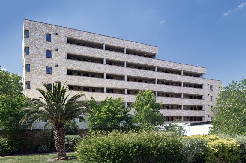
Pastel bricks such as Floren’s Alaska Rustic or Blockleys Park Royal are appearing more frequently across housing, education and mixed-use developments, bringing a softer feel to the built environment. Pale creams, light buffs, and gentle pinks have always been a staple in brickmaking, often reflecting the natural qualities of the clay from which they were made. Their renewed popularity stems from a desire for buildings that evoke a sense of calm and welcome, rather than feeling harsh or imposing. These lighter tones reflect more daylight and can help larger elevations feel less heavy, particularly in dense urban settings. Used well, pastel bricks can create façades that feel warm and human in scale, while still offering the durability and depth that clay provides. Subtle changes in tone across a wall also add interest without relying on strong contrasts or decorative elements.